Linio
Rebuilding Mobile Shopping Experience
A complete redesign of Linio’s mobile platforms that increased conversion, raised average order value, and set the foundation for a new design system.

Overview
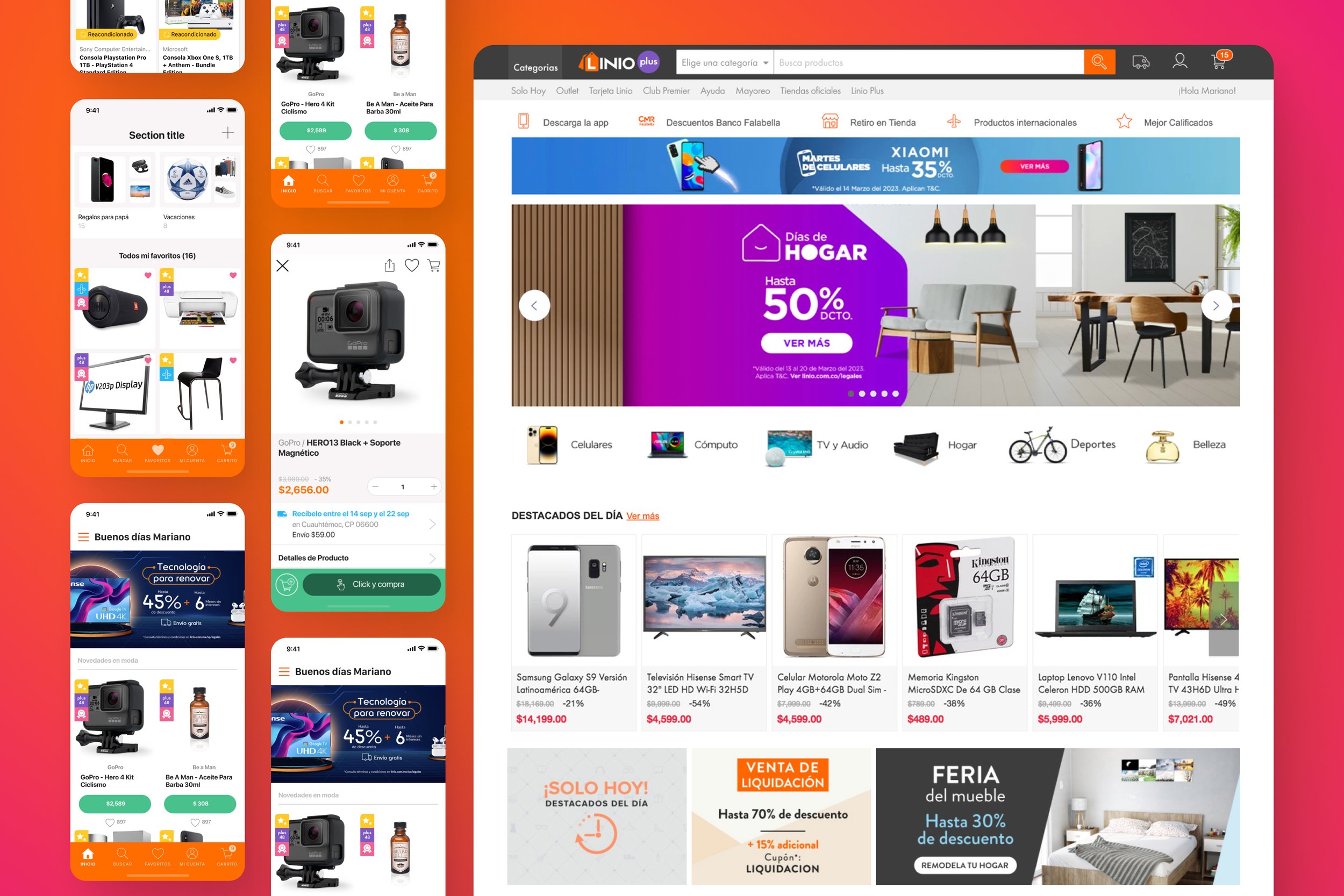
I led the UI/UX redesign of the Linio mobile apps and web platform, transforming legacy desktop-first flows into a cohesive mobile-first experience across Latin America.
Role:
Senior UX / UI Designer
Duration:
7 Months
Contribution:
Product Design
UI Design
UX Design
Interaction Design
Visual Language Refresh
UX Writing
Prototyping
Design System Foundations
Cross-platform Alignment (iOS, Android, Web)
Team:
iOS Development
Android Development
Project Manager
Product Management
Infrastructure / Backend
Web Development
Data
QA / Testing
Platform:
iOS, Android, Web
Problem
The mobile apps and website still reflected an older desktop-first mindset in a market where mobile usage dominated. Navigation was cumbersome, content dense, and the mobile experience lacked clarity and performance. Meanwhile, the backend system and APIs limited the ability to overhaul functional flows, so we needed to deliver a modern experience on top of the existing architecture.
Challenges &
Constraints
Legacy architecture: redesign on top of existing backend and API, minimal functional change at first
Shift to mobile-first culture across product teams
Consistency across iOS, Android, and Web while maintaining native guidelines
7-month timeline to redesign core flows (home, product discovery, detail, checkout, account)
Build a reusable design system in parallel to shipping major redesign
Audience &
Use Case
Users
Price-sensitive, mobile-heavy shoppers in Latin American markets, often browsing on mid-range devices with unstable network connections.
Use case
Browsing promotions on mobile, comparing products based on price/delivery/seller, and completing purchases quickly with minimal friction
Success Criteria
Pre-launch: treat these as hypotheses until tested.
Increase mobile conversion on iOS and Android
Improve scannability and reduce friction across key flows
Raise average order value (AOV) through clearer hierarchy
Grow mobile traffic share and its contribution to revenue
Establish a reusable visual language and early design system tokens
Solution
Focused on a mobile-first redesign: we refreshed visual language (color, typography, iconography), simplified layouts to prioritise clarity on small screens, and introduced modular, reusable blocks. We began with mobile apps, then extended patterns to desktop. Concurrently, we built an internal design system to govern future features.
Process
Research & audit
Analysed existing analytics and supported findings with stakeholder input to identify key drop-off points.
Visual exploration
We explored multiple visual directions to balance brand recognition, hierarchy, and marketplace density. This helped define a modern look that remained familiar to existing users.
Flow validation
We validated the new mobile flows through internal reviews and prototype feedback. Once core tasks were clear and predictable, we extended the redesign to desktop.
Mobile first structure
Prioritised mobile apps, redesigned navigation (bottom nav), and simplified content-heavy screens for one-hand use.
Desktop extension
Adapted mobile patterns to desktop, maintaining consistency while optimising density and layout.
Design system highlights
Defined foundations (tokens, type scale, spacing), component library (buttons, inputs, cards), and documentation to streamline future projects.
Validation
iOS conversion rate increased from ~4% to ~5.5%
Android conversion rate increased from ~1% to ~2.5%
Mobile platforms saw ~4% traffic growth, contributing
to ~3% revenue uplift
The redesign drove ~23% increase in Average Order Value (AOV)
The mobile app surpassed 10 million downloads with an average rating of 4.7
Outcomes
Mobile apps evolved to a truly mobile-first experience
Conversion, traffic, AOV and revenue showed measurable improvement
The new visual language became the platform for future initiatives (Wallet, order tracking, account features)
Internal design system provided scalable foundation for ongoing work
Learnings
Delivering meaningful impact is possible even without rebuilding backend—focus on hierarchy, clarity, and flow.
Adopting mobile-first changes how you think about layout, copy and interaction.
Starting a design system early—even in lightweight form—accelerates future projects and ensures consistency.